KNOT

“You’d know this stuff if you’d been in the Boy Scouts.”

BACKGROUND

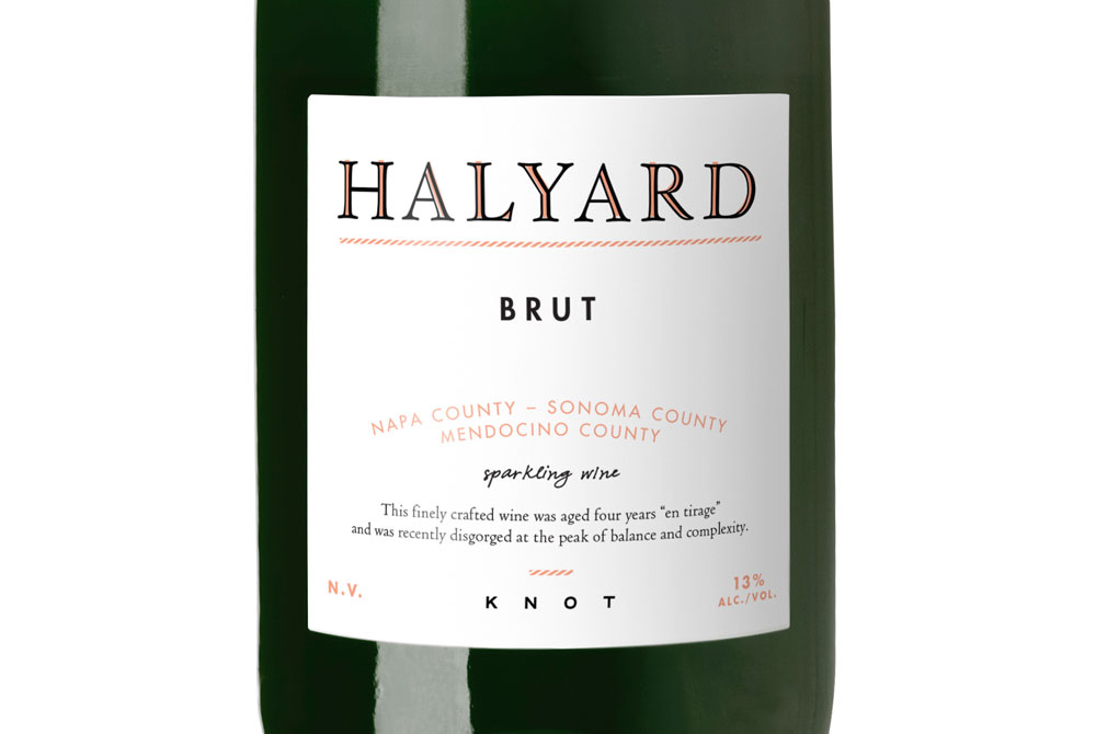
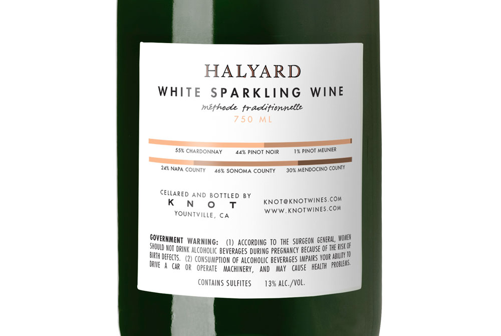
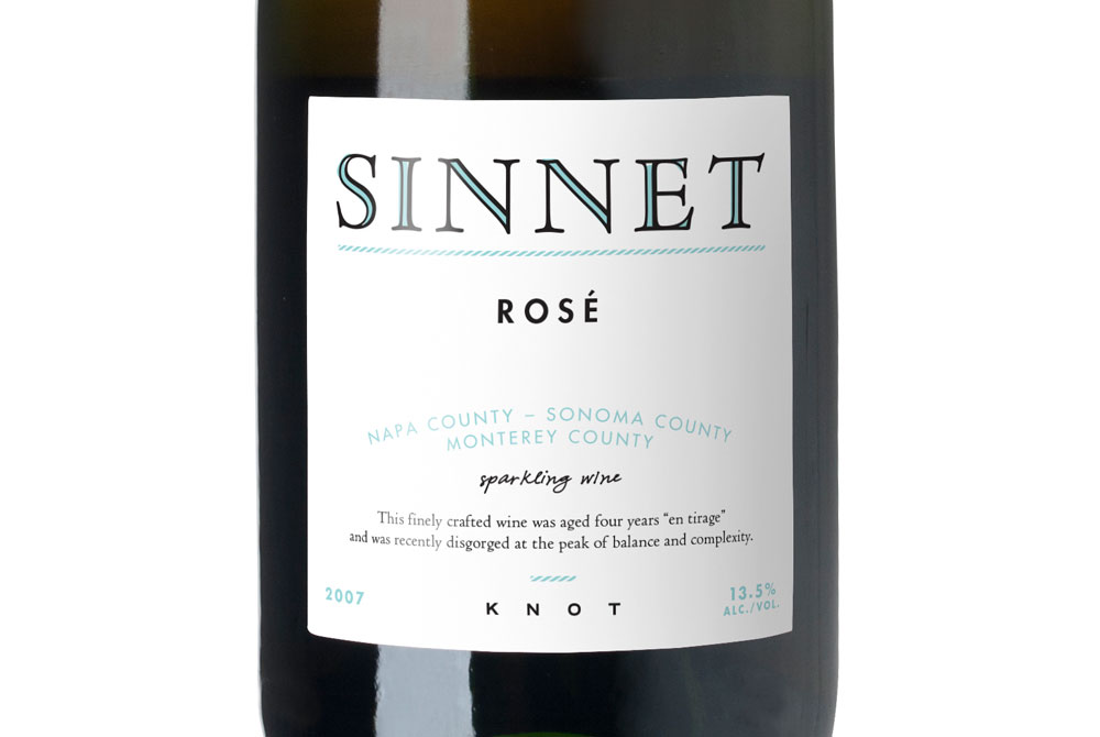
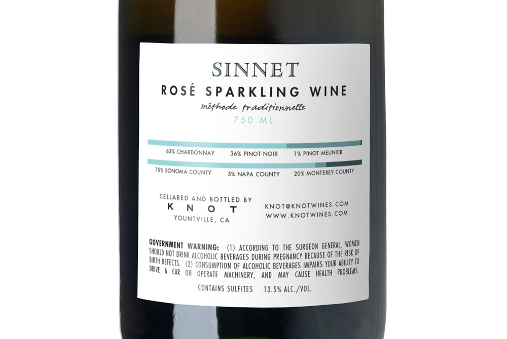
Knot is a negociant brand. That is, they buy grapes from various sources, and then have them blended and bottled under their own name. As different grapes become available, different wines are created. It’s a very opportunistic business. What name, the client asked, could allude to that sort of business relationship and still have some charm?
We came up with “Knot,” a metaphor for the temporary ties the client has to its suppliers. Since it's been a long time since my merit badge in this
area, we turned to Wikipedia to discover that here are as many types of knots as there are wines. In terms of design, the client wanted to avoid the classical European references (borders, filigrees, swirling script) and instead strive for something distinctly “American.” Our logotype and its color fill was inspired by Sailor Jerry, a prominent American tattoo artist, whose time at sea greatly influenced his work.