REALM

“Big changes are risky... but with all we'd been through, it felt riskier not to change.”
OVERVIEW

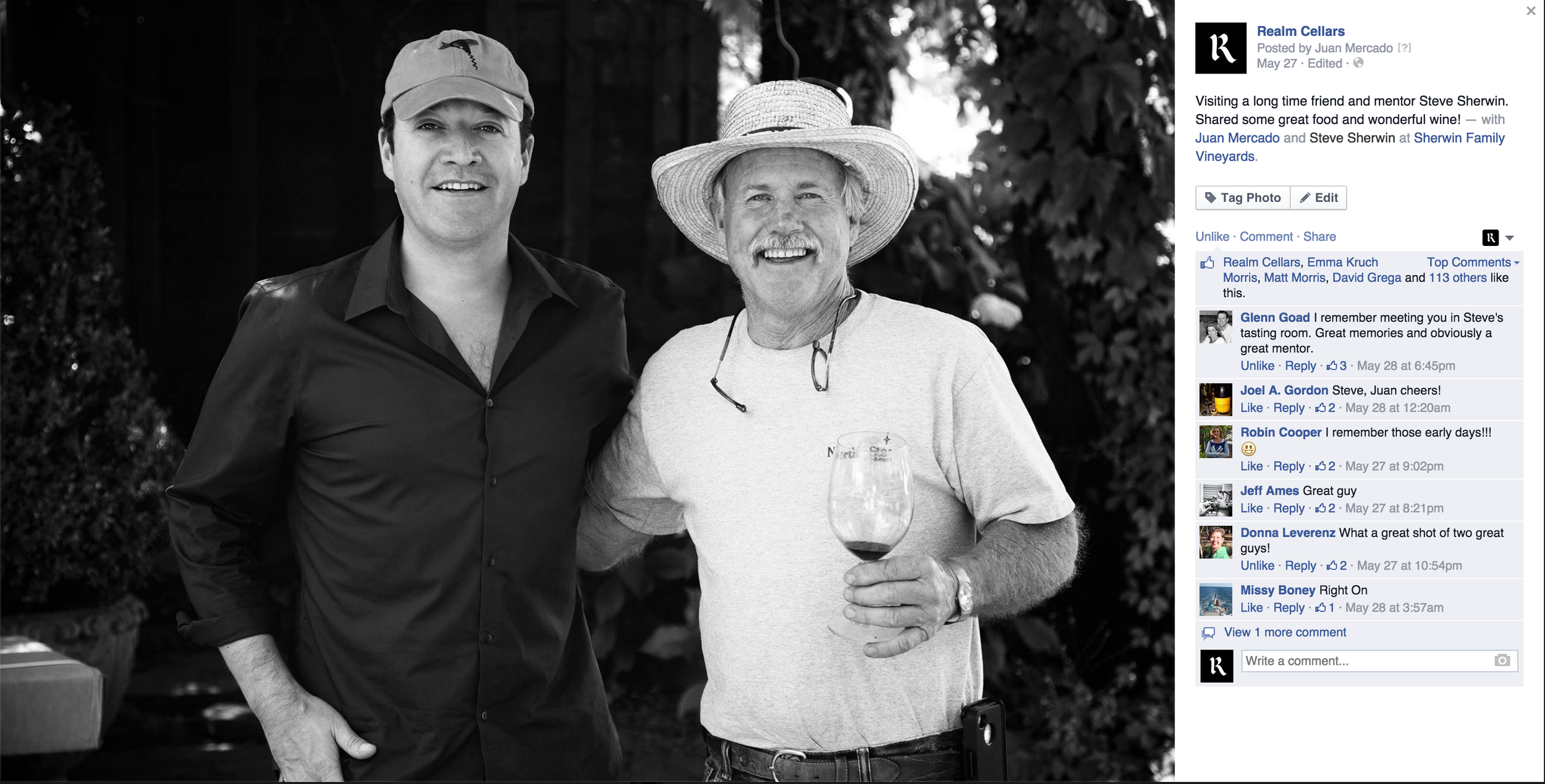
Realm Cellars was Juan Mercado's passion project while working as a nurse. He bootstrapped his label in 2001, notably getting some fruit from Beckstoffer To Kalon and good scores right out of the gate. He built a following one handshake at a time, and Realm became a sought after yet under the radar cult favorite in Napa. I met Juan 10 years into running the business, when he had brought in a new partner with venture capital connections, and they were ready to transform Realm into a world-class brand.
I worked closely with the team for almost two years, starting with brand concept and brand strategy and
following all the way through to logo, six labels, website, video, photo, maps and collateral.
The strategy was complex, but summed up succinctly we were solving a few problems. They were a modern negociant-model wine brand that represented the best elements of "New Napa" but had a tired, classic Shakespearian label system that unsuccessfully mimicked the old guard, and we needed to make the brand reflect the business. We also needed to find a way to encapsulate and distribute Juan throughout the brand, preserving the qualities and personal connections he brought to it while enabling him to be more places at once, and allowing the brand to grow.

content Strategy
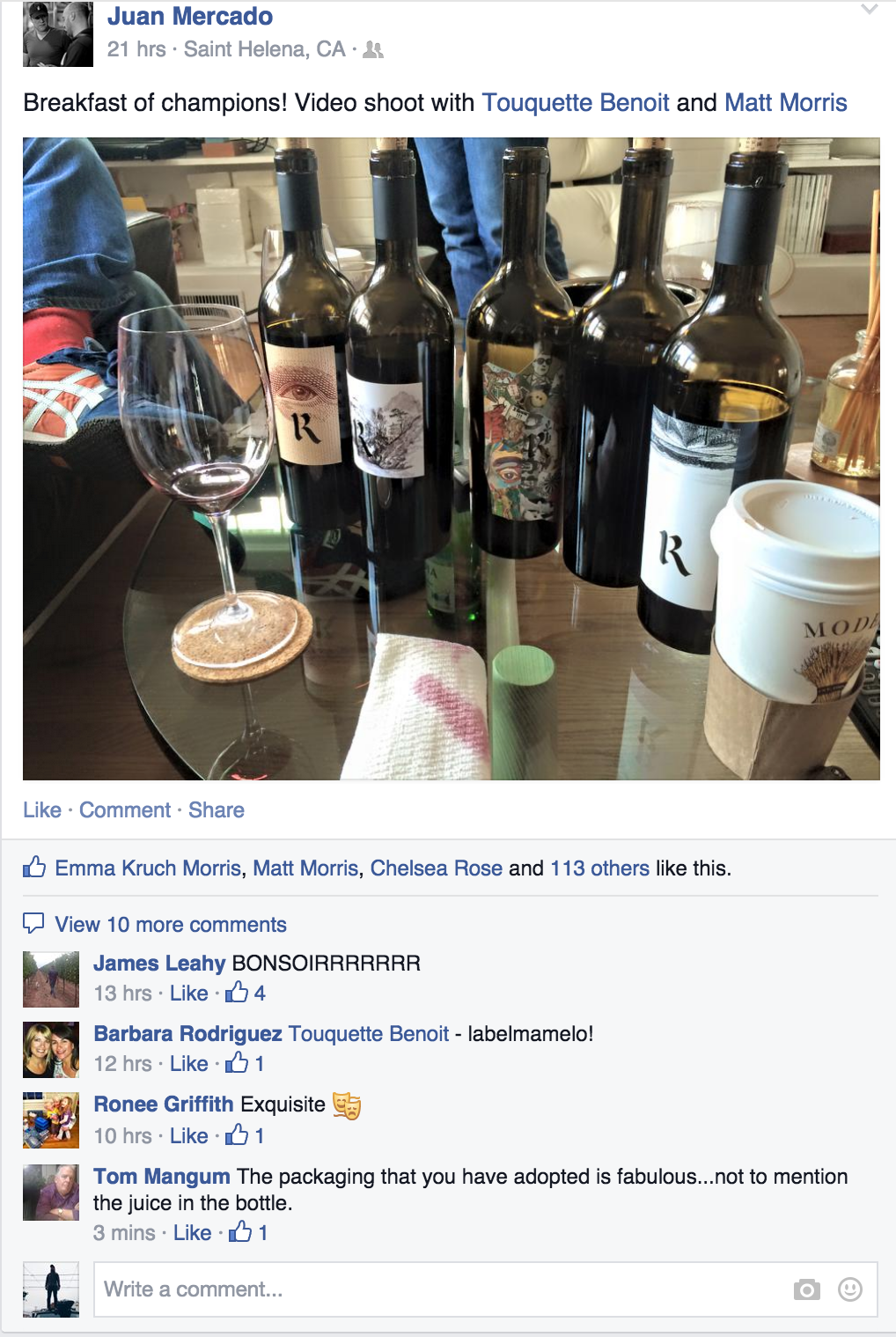
We accomplished this with a series of black and white videos that focused on Juan and the personal stories around the wines, central to the website and release letters. The lo-fi approach kept production lightweight and inexpensive, and gave them a cohesive branded aesthetic that you'd recognize anywhere.
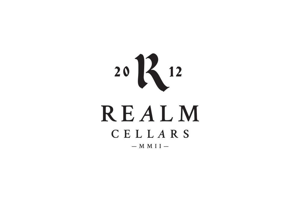
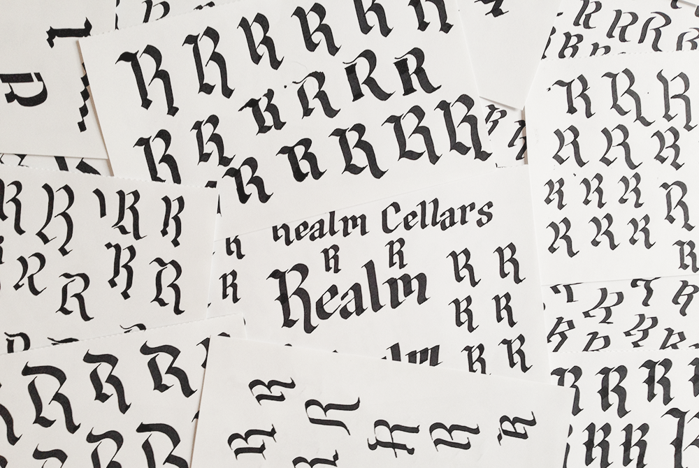
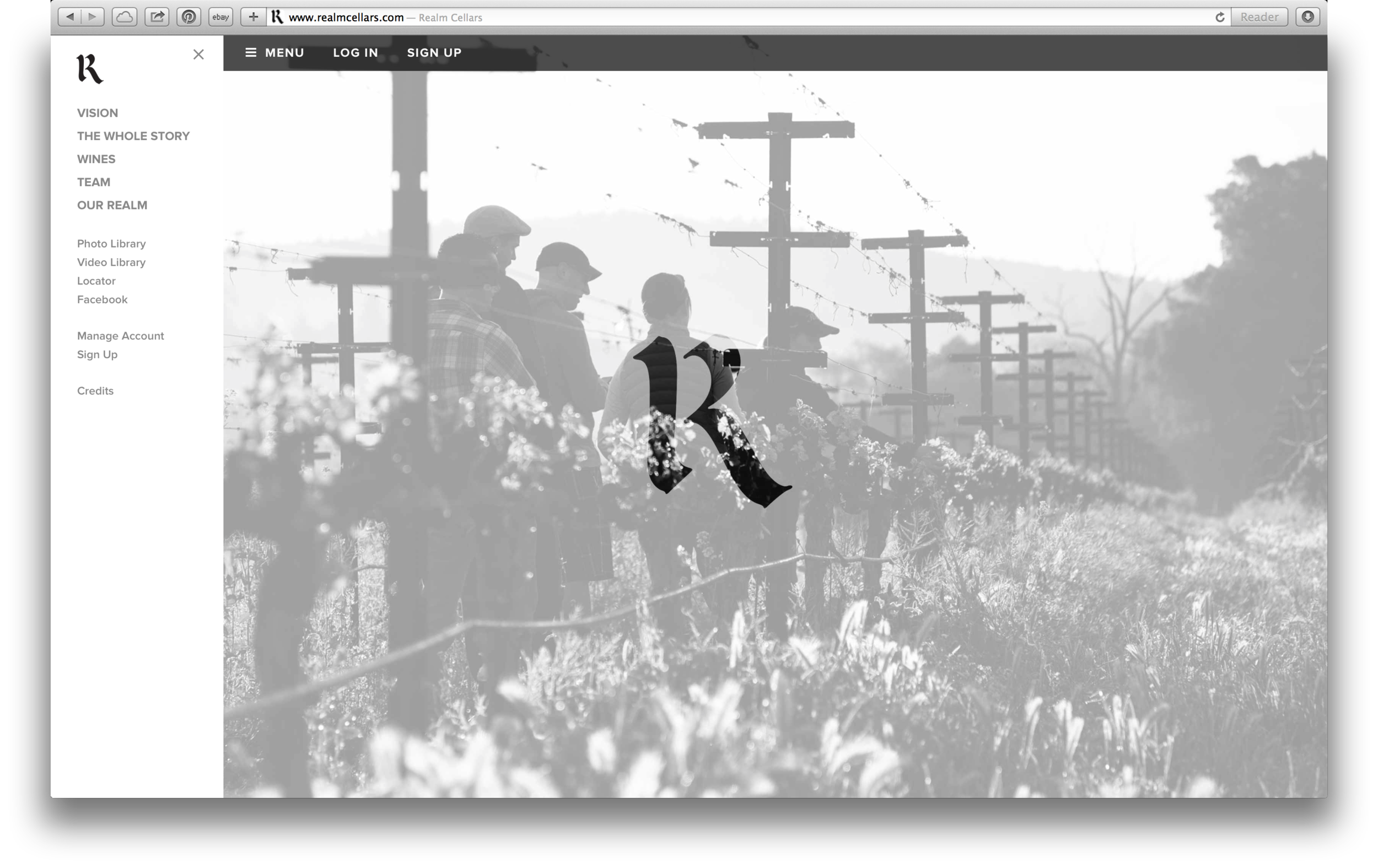
IDENTITY
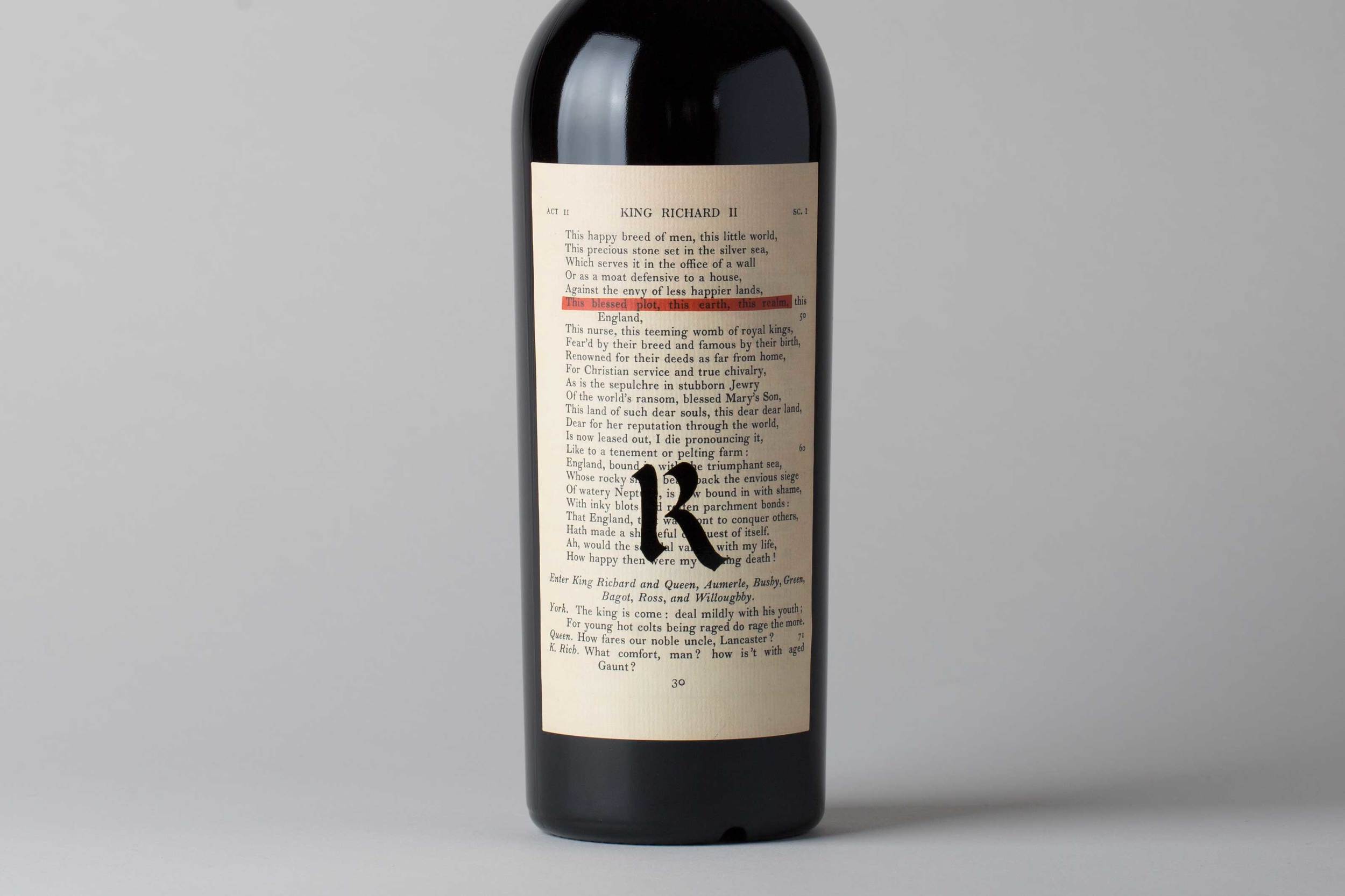
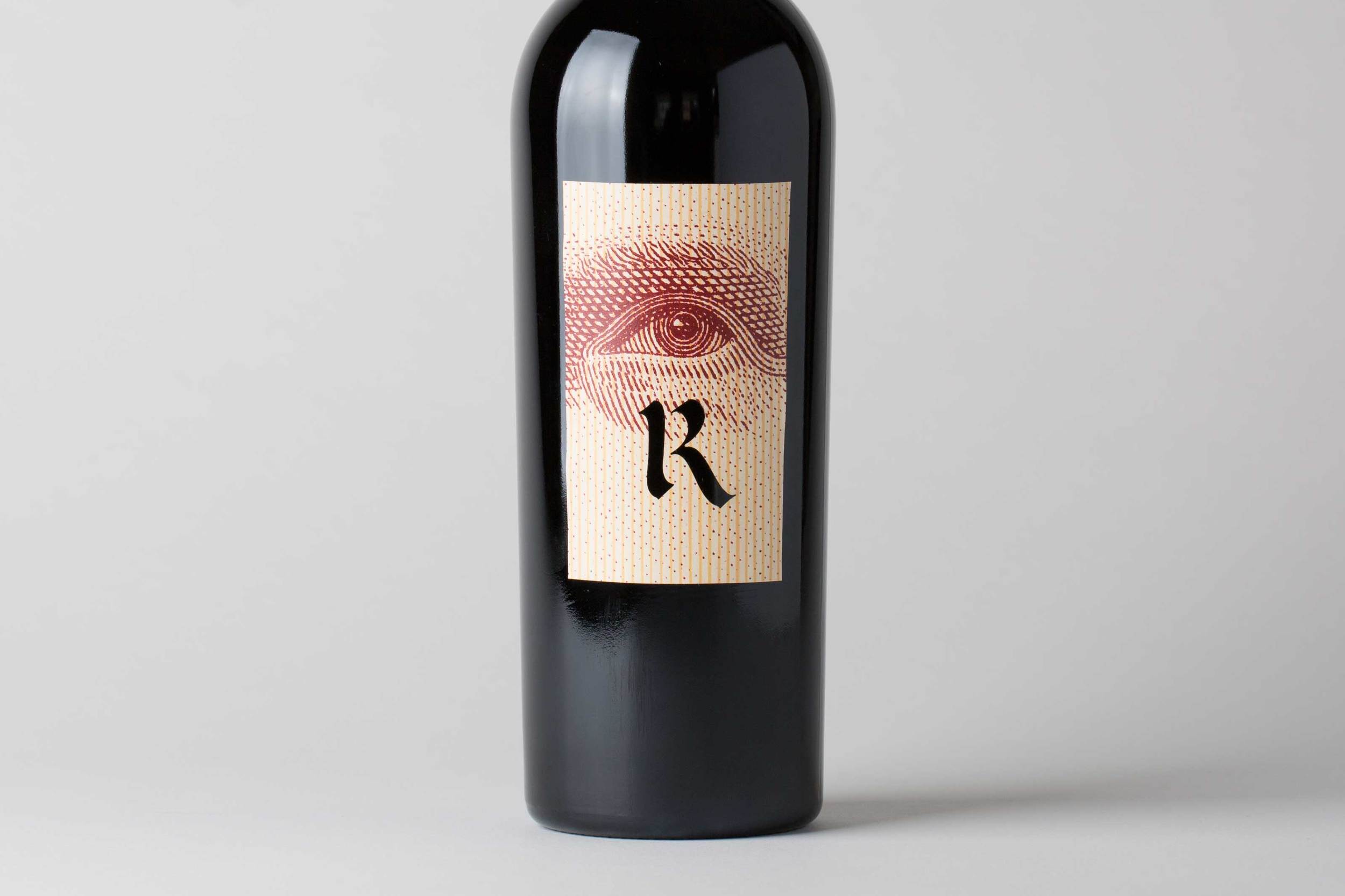
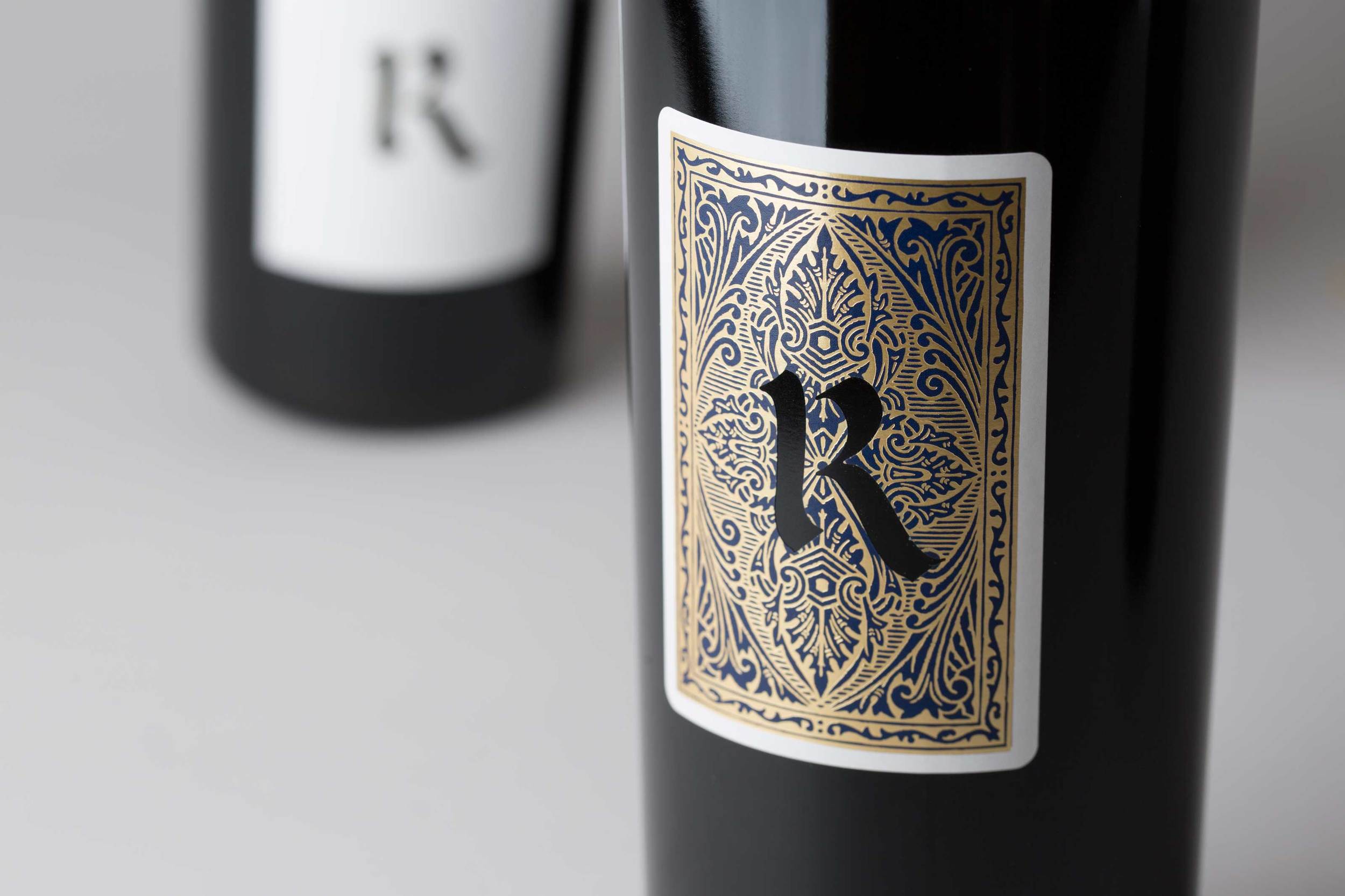
We went through thousands of hand-lettered versions of calligraphic R's to find the balance between an iconic form that spoke to the old Shakespearian system and the hand-drawn script, and being able to survive the laser die-cutting technique all the way through to bottling. It was worth the effort.

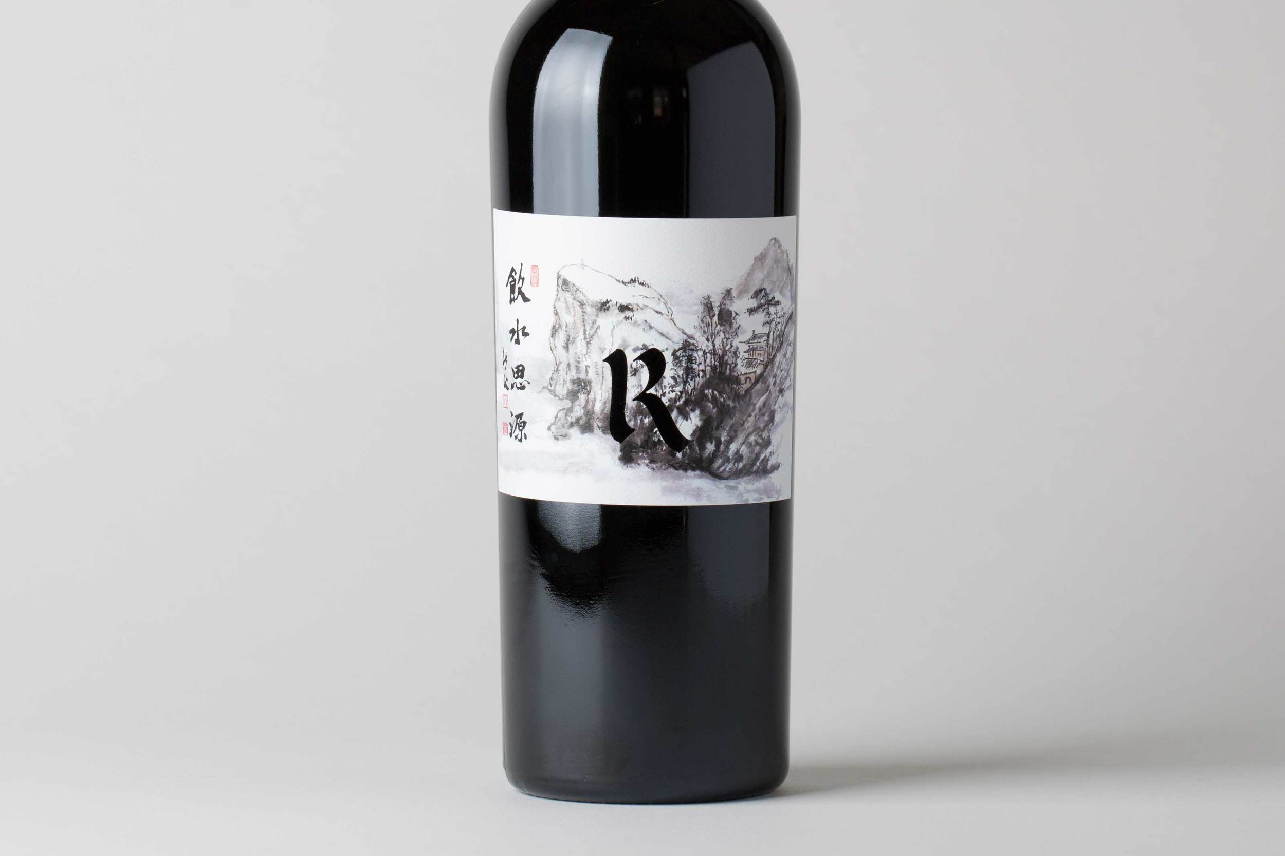
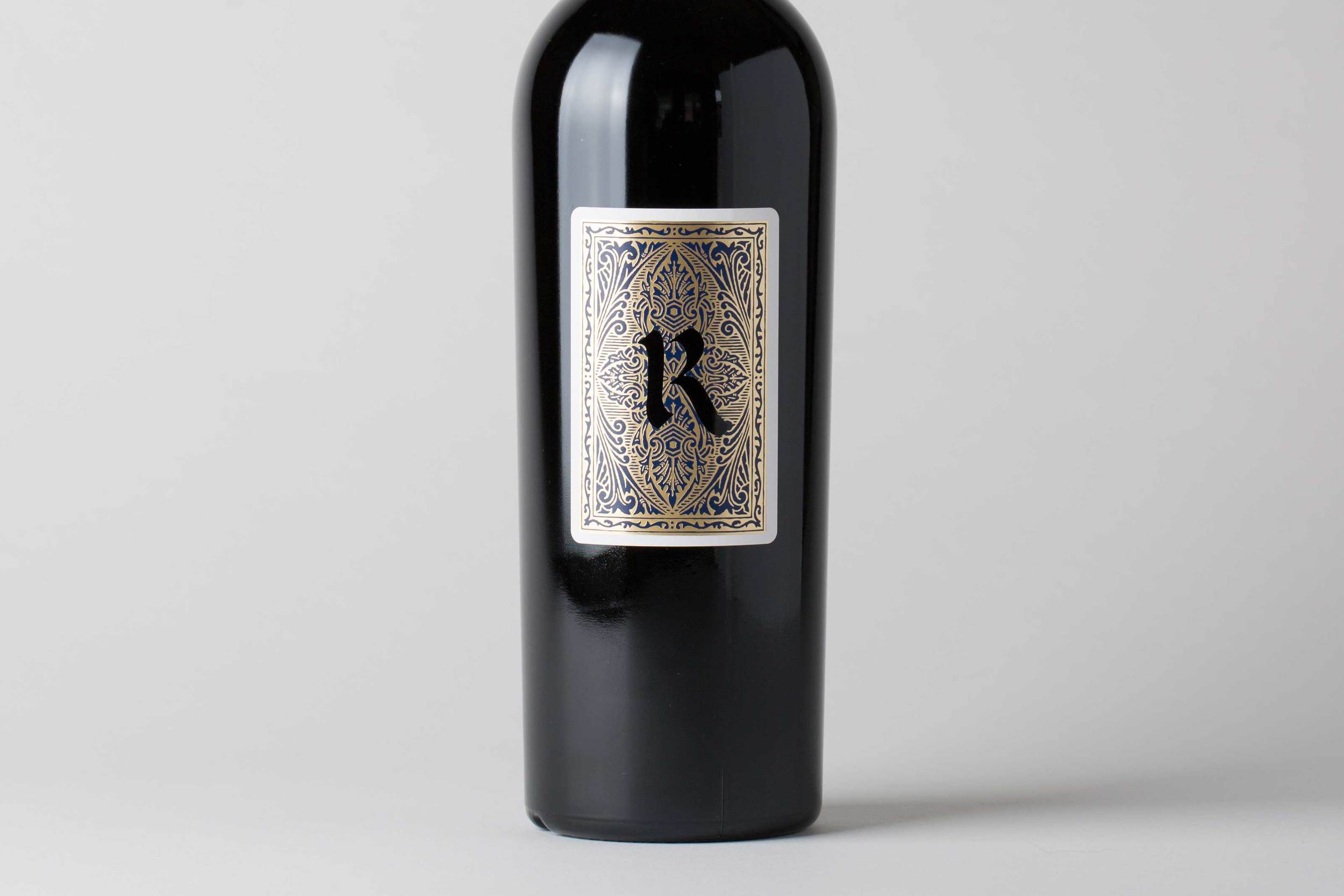
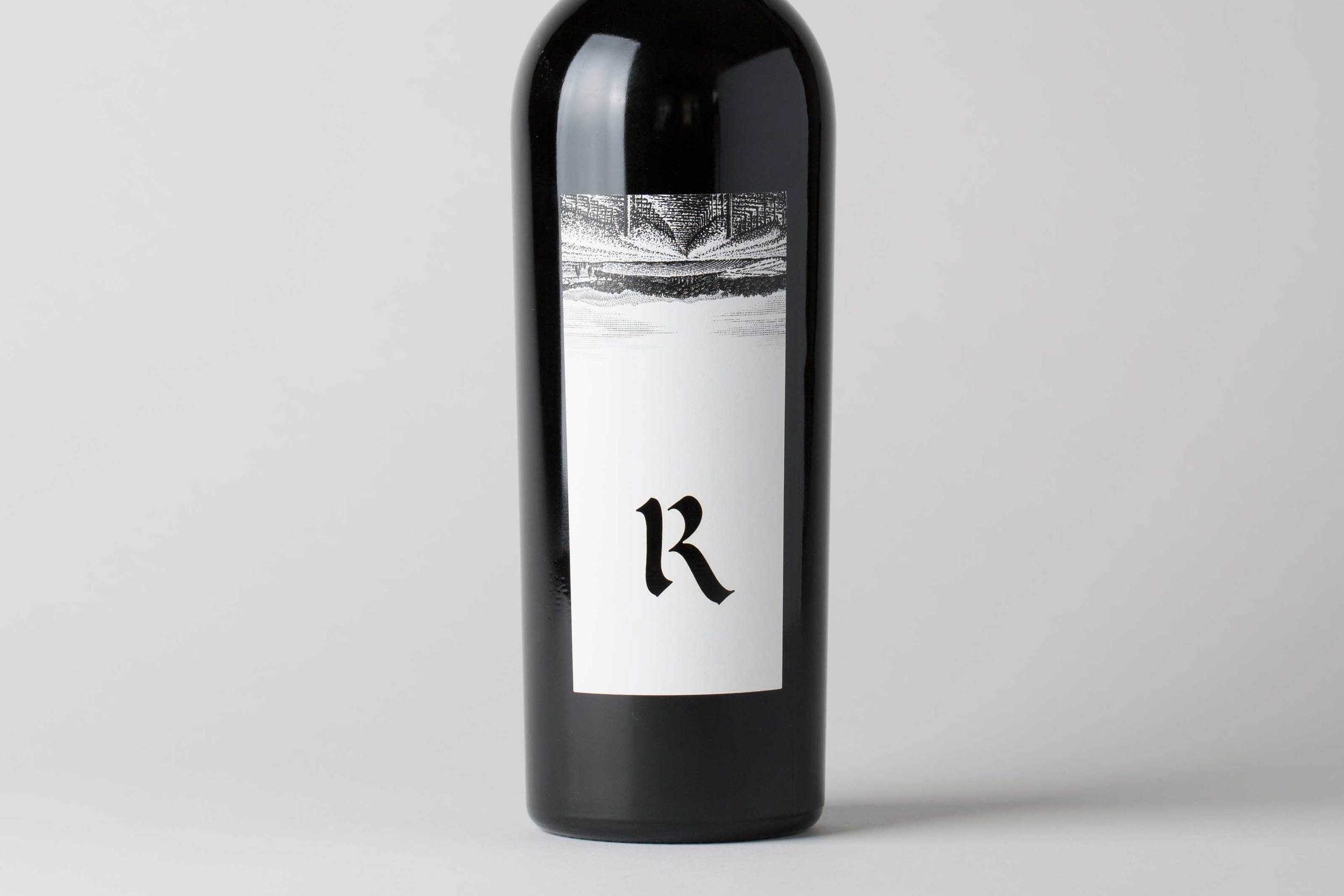
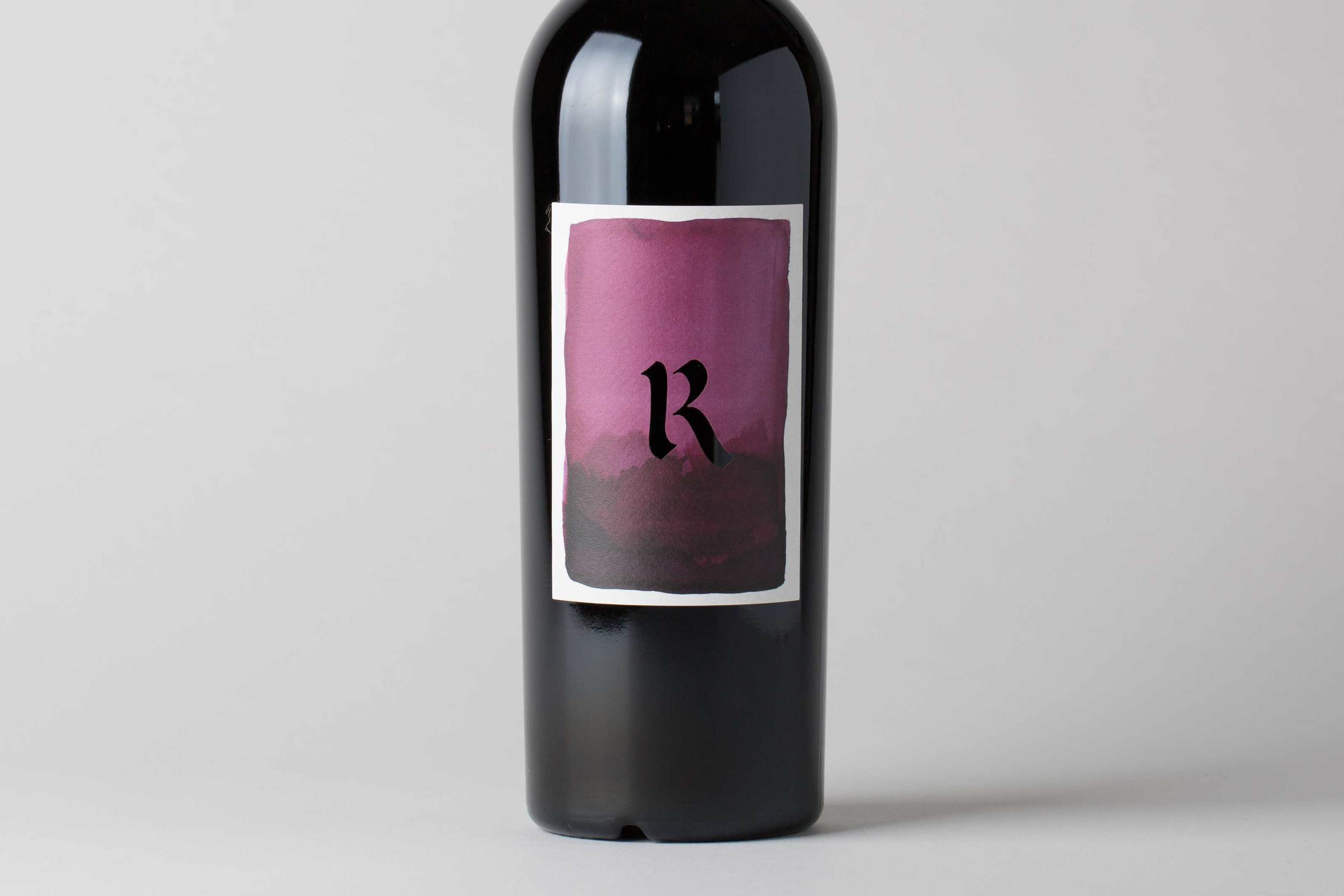
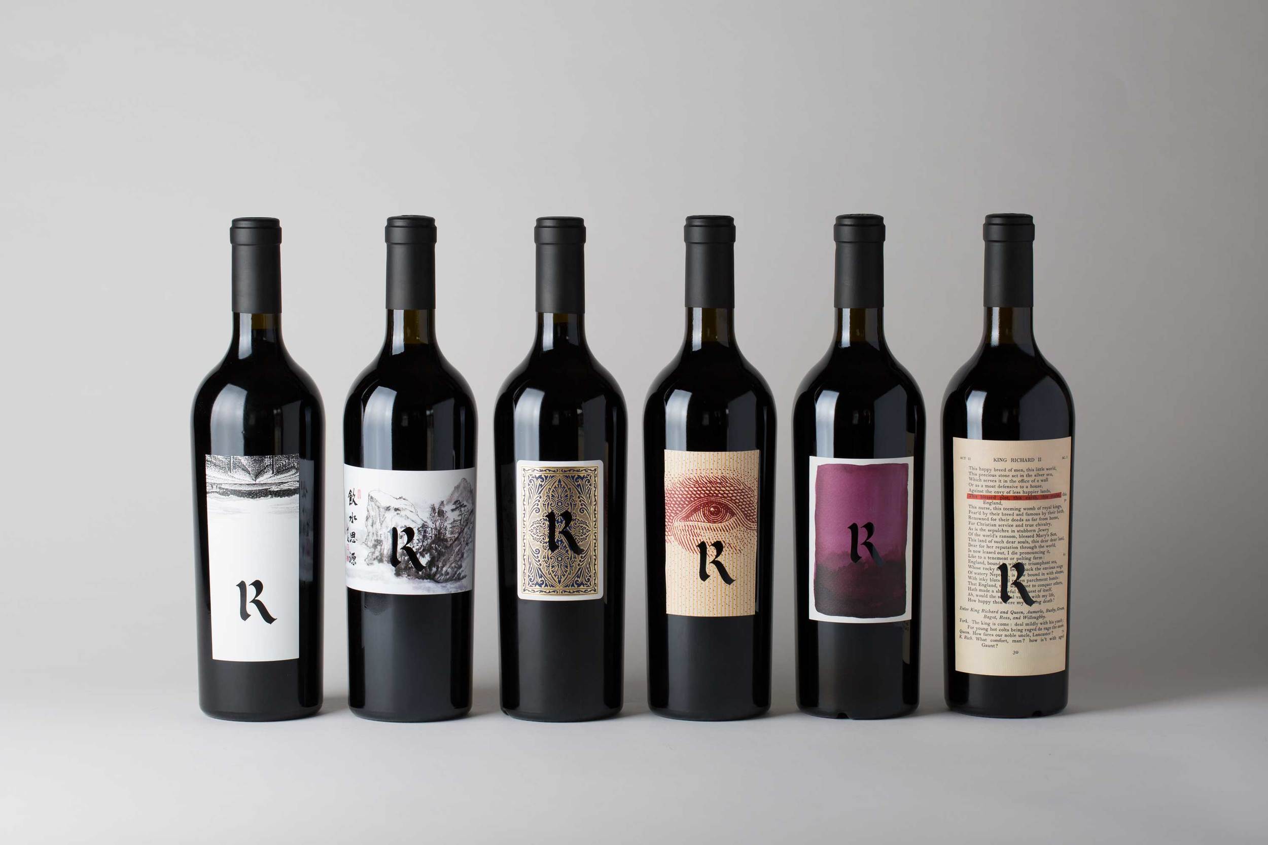
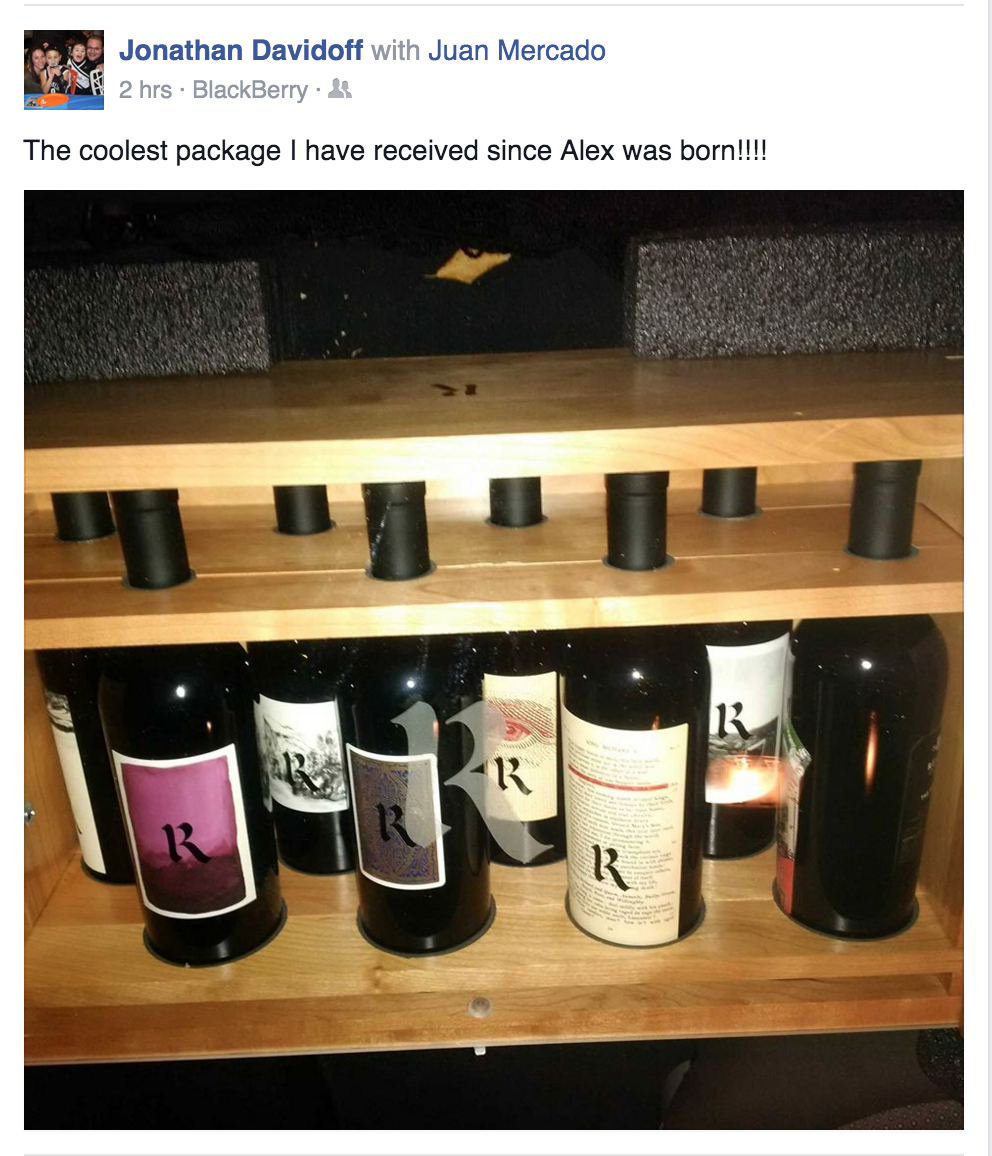
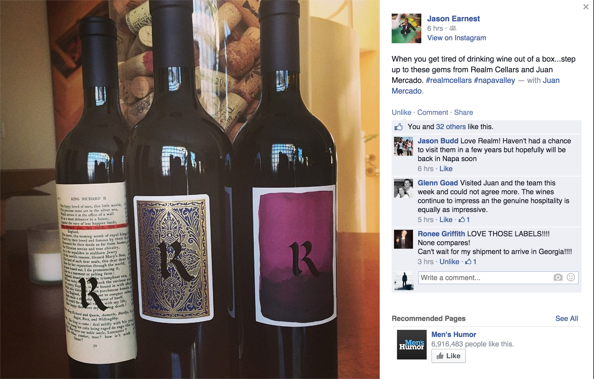
PACKAGING
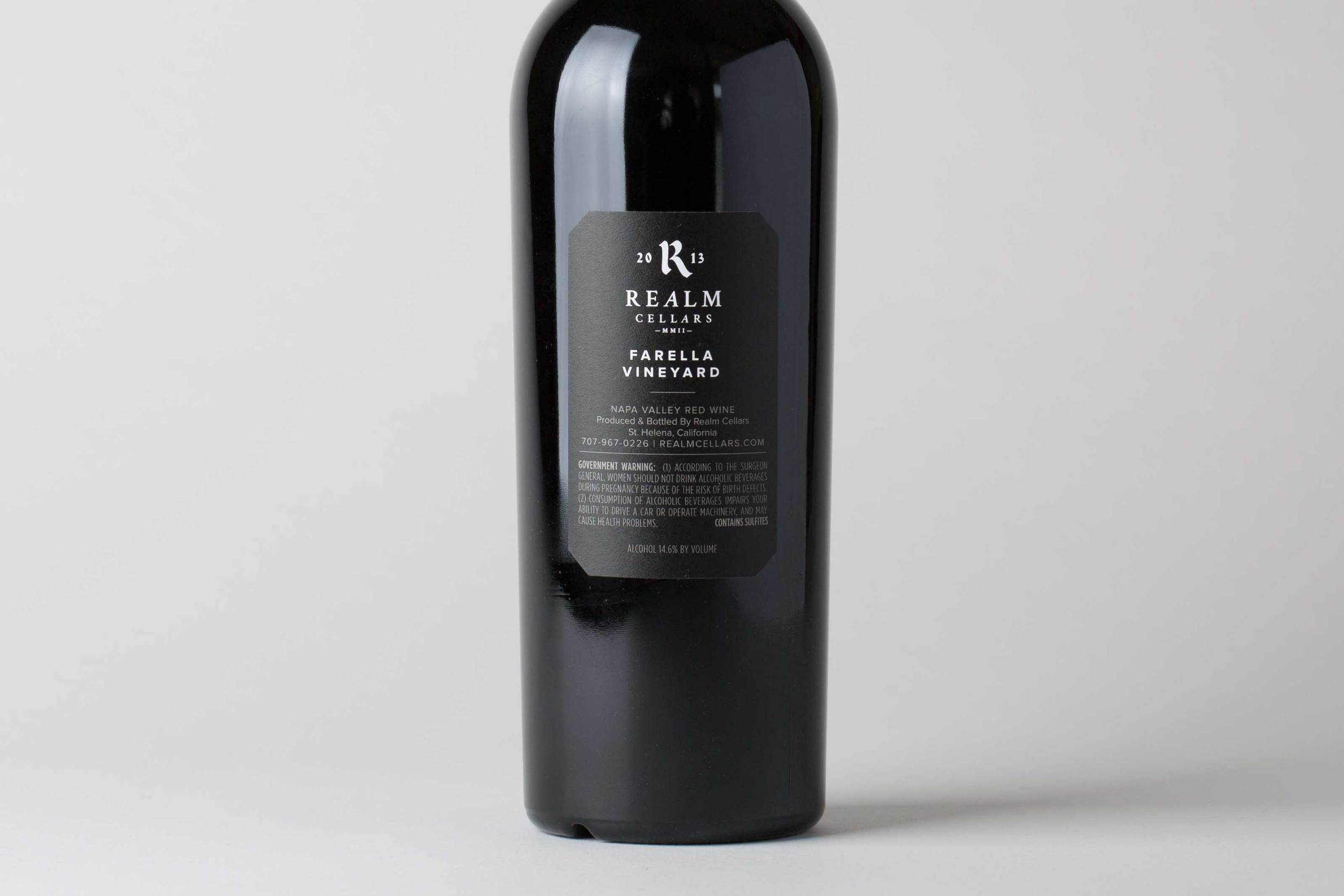
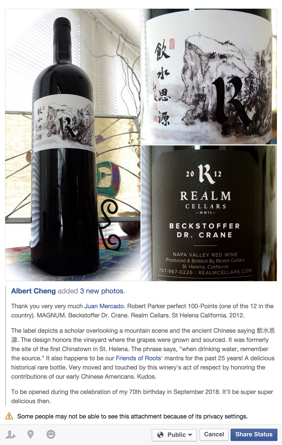
The label system is taken directly from their relationship with their vineyards—each label is unique to the blend or vineyard designate, and is a token of the story or history behind it. The R is laser-cut out of the label, further emphasizing the 'found-art / object' element of the system.
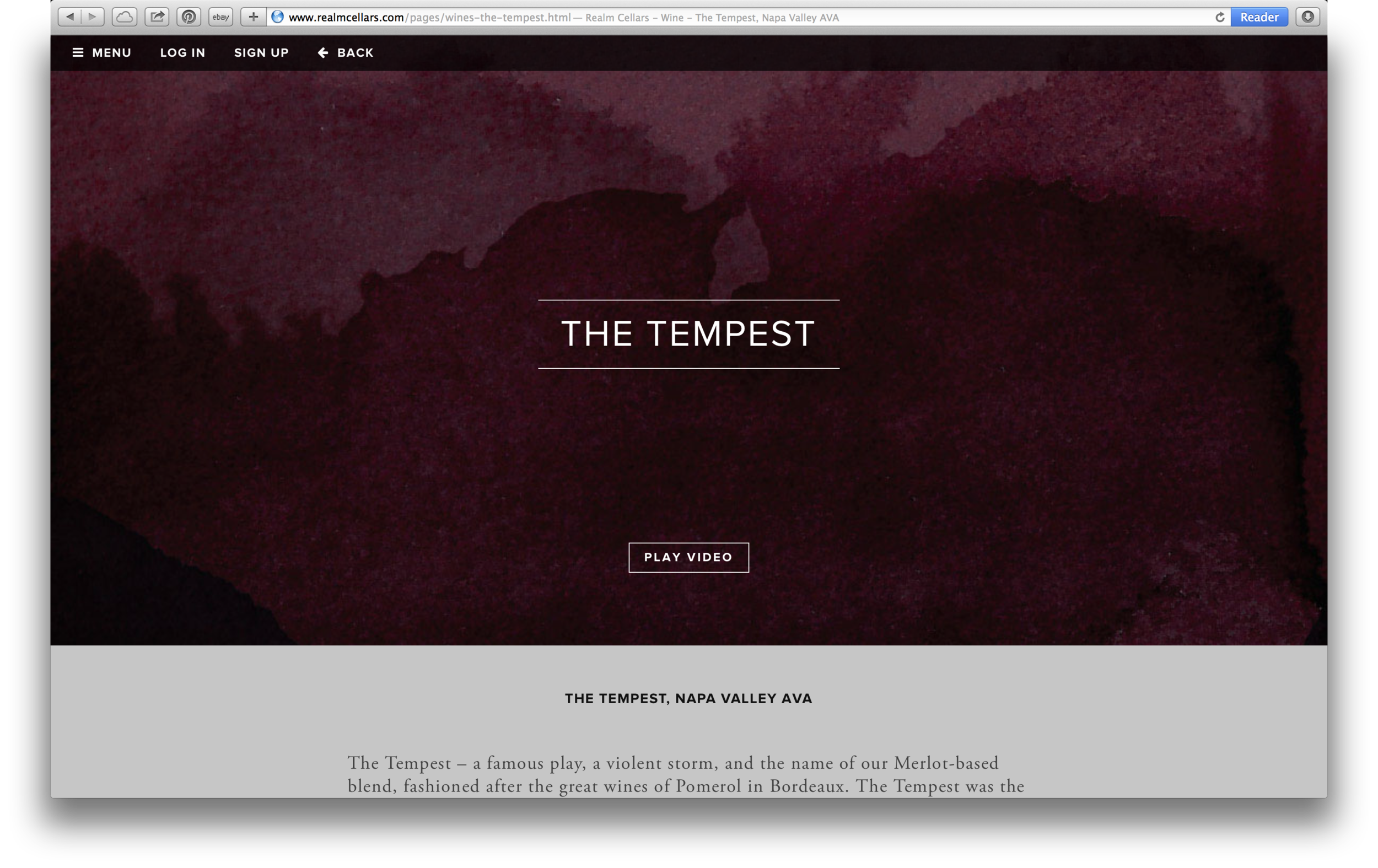
WEBSITE
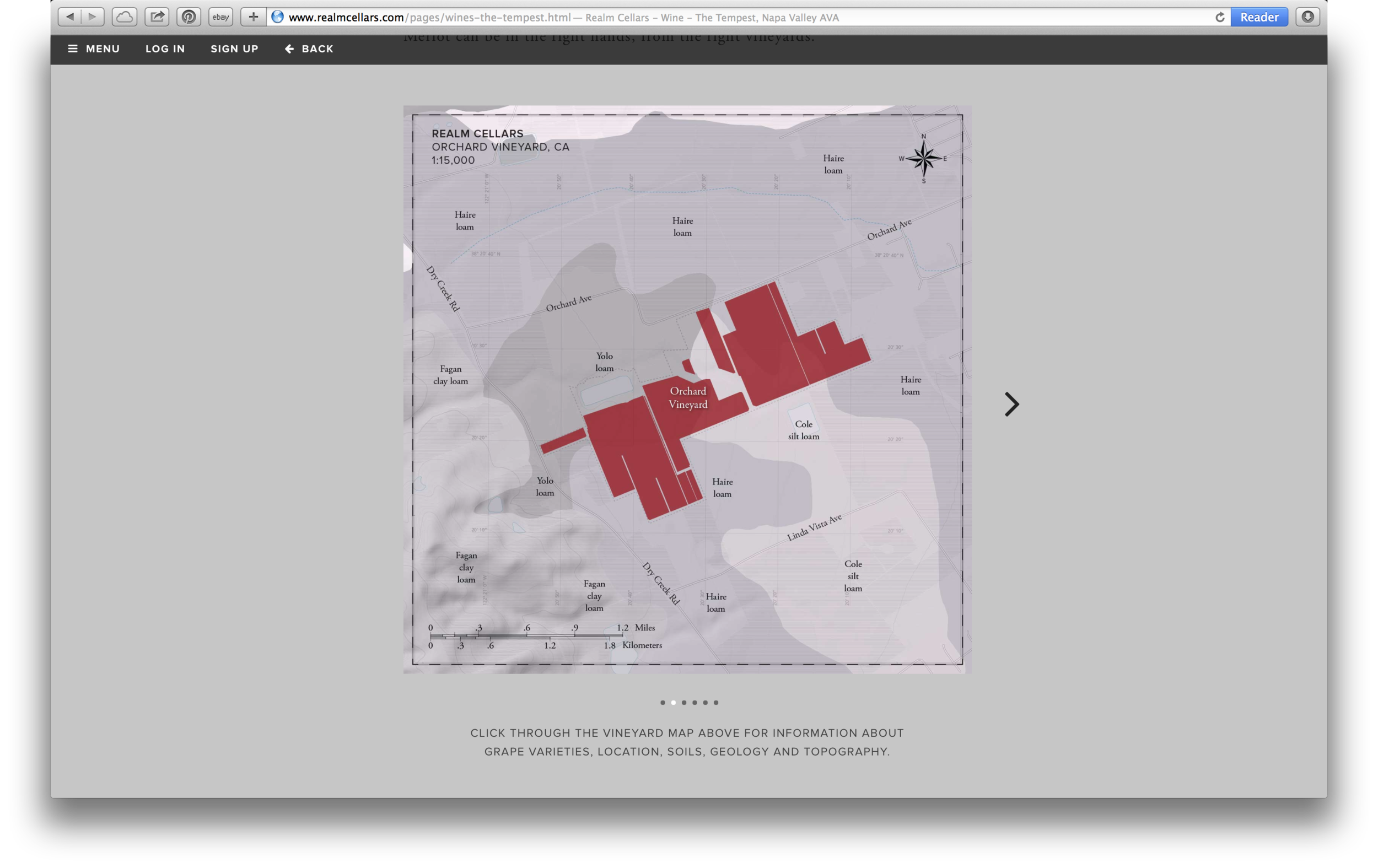
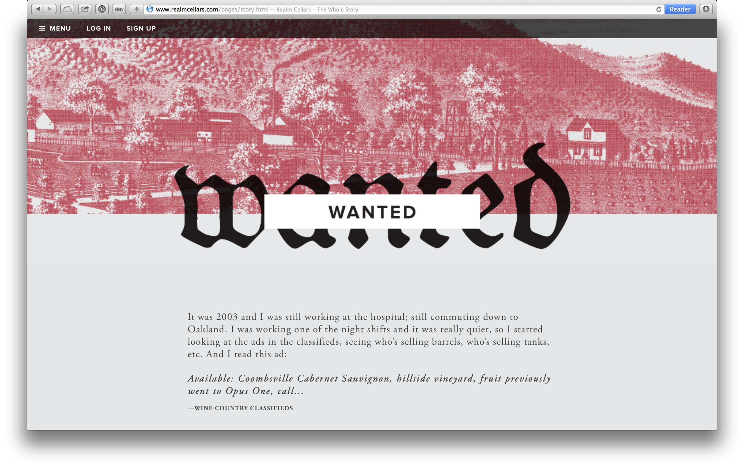
The website is a media platform, meant to evolve with each vintage, incorporating a substantial amount of video. Long-form storytelling in the 'whole story' section pays homage to Juan's determination through turmoil and terrible luck to where he is today, a story that many customers identified with and attached themselves to. In addition to video and storytelling, we created a branded map style for Realm that reflected the technical nature of their winemaker and the way he influences their farming - each vineyard has in depth overlays showing soil types, slope / aspect, varietals planted and more.
RESULT
The response has been incredible—release sales were up over 40% in the first 24 hours, and sold out faster than any previous year. Social media presence of the new labels has been overwhelming, and glowing feedback received for all parts of the re-brand. Feedback has consistently stated that this “felt more like Realm than the old labels,” which was one of our central goals. Shortly thereafter they also scored two 100pt scores and a 99pt in the same year, across three of their wines; an incredible coup for their winemaker Benoit Touquette.
Services:
Brand Strategy
Content Strategy
Identity
Label Design
Website Design
Photo Direction
Print Collateral
Signage