LAST BOTTLE

“Do whatever you think is gonna work just so long as it works.”
CASE STUDY

The “flash” sales concept originated in the fashion industry, where looks are fleeting, shoppers are fickle and inventory is a four-letter word. One-day-only sales have long been a favored tactic.
In the wine business, however, it isn't new looks that drive out the old, but new vintages. New vintages are as regular as,
well, clockwork. So naturally, the industry was drawn to the flash sales model.
The problem is, wine flash sales sites are decidedly unfashionable. Many are amateurishly designed and most are conspicuously indifferent to the needs of luxury consumers. The client asked if we could take them to the next level.

IDENTITY
We had to communicate three things with logo: Old-World luxury, Napa Valley and Sale. These things mix as well as paisley and plaid. Still...
In choosing a font, we looked to history. In the early days of graphic design, most type was custom and hand-drawn. This meant a lot of liberties were taken in the form of artful details and exaggerations that made the characters unique. We found a face with period details that we could further exaggerate to get the effect we were after.
Our next consideration was color. Here we chose a primary red to provide contrast to an otherwise highbrow logotype and to communicate the brand’s core proposition. Red being the universal color for “sale.”
Finally, the way we dealt with “Napa Valley” was to literally bake it into the logo as an over-line. Napa isn’t just Last Bottle’s home, it’s the center of the wine universe. Unlike its competitors who parachute into town and troll for distress sales, Last Bottle‘s owners live here and know every important producer personally.
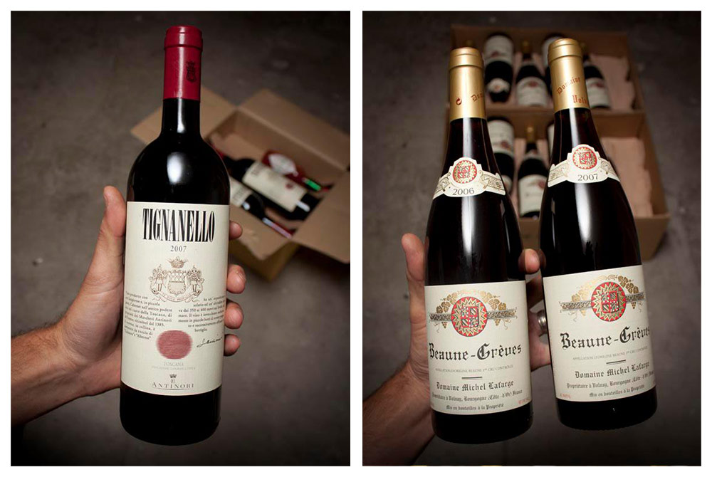
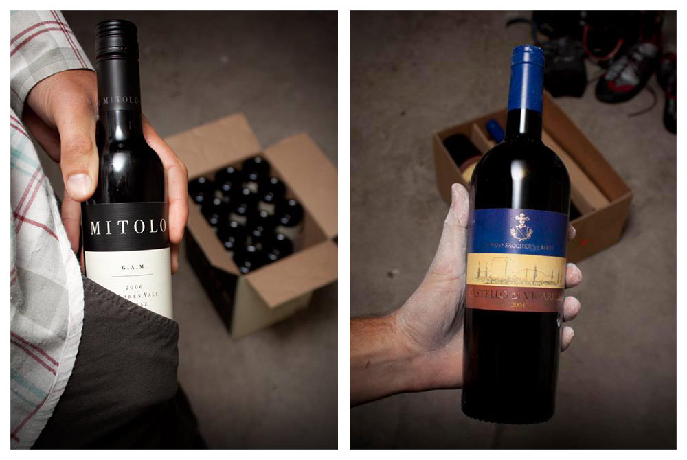
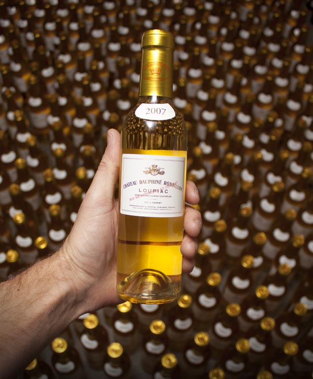
PHOTO STYLE
When selling luxury goods on the secondary market – be they art, antiques or wine – it is axiomatic that you must first establish trust. Are the goods what you say they are?
Photography can go a long way toward answering that question. So we set out to make Last Bottle’s photographic style hyper-real. Rather than place the bottles in a standard photo booth – with perfectly even lighting and no extraneous background detail – we put them in a person’s hand and shot them in situ: right on the warehouse floor, pulled from a just-opened case.
The effect is two-fold. It confirms the authenticity of the lot being sold and it adds a human element that is unique in the industry. Once you have a person’s hand in the frame, it’s easy to add a narrative element about the wine, the weather, whatever you want to say that day.
We built a turn-key studio for the client that allowed them to capture sharp digital images on the fly and process them automatically. Because the lighting is simple, they never have to fuss with set-ups and the pictures couldn’t look more real.
WEBSITE
Our priorities were simple.
We needed to get the photography in front of the customer as large and impactfully as we could, without getting so custom that we couldn't duplicate it in email. Layout became an exercise in minimalism - how much can we do with very little?
By 'hiding' functionality in obvious places (the label view, multiple notes / scores, etc) we were able to keep the important behavior-driving elements top of mind - the price, purchase button and your available credits. We think the effect is compelling but more importantly the platform has seen wild success!
"After nearly fifteen years of working with various design and technology companies, [Alta] took it to whole new level for us. Their commitment to do the absolute best at every stage was beyond impressive - it was inspiring.
From the initial consultations to the photography, design and overall flow, they were meticulous, hard-working, creative, timely, and went out of their way to understand our needs and what the customer wanted. The final product, Last Bottle, has been huge, literally an overnight success. We can’t say enough about these guys!”
– Stefan Blicker, Last Bottle
Services:
Brand Identity
Website Design
Photo Direction
Print Collateral
Signage